

Have you ever wondered why reports are so boring?
Every-time someone mentions the word report a shudder runs down your spine as you anticipate having to look through another sheet on excel. It doesn't have to be this way for you or your intended audience.
Design is often overlooked in the process of building your report but can be a one-way ticket for ensuring your audience not only read what you share with them but remember it as well. If you don't look into using design in your report you can run the risk of it becoming boring, bland, and forgotten. This is why you need design to solve this issue of boring reports. Below are 3 reasons why design is the way to make kick-ass reports.
The brain is drawn to beautiful things, as we can see by what people engage with on social media.
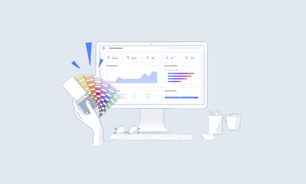
Using design in your reports can spark interest and grab the attention of the audience more than a spreadsheet will. A good starting point is to use color and a consistent layout, keeping your content user-friendly by translating complex information into an easy to read format.
It's simple. Well-designed reports make your information easier to digest which will directly increase the appeal to your audience.
At Numerro high-quality design is at the core of what we do. We organize complex elements easily, using a clear interface design. This gives you the power to build reports that communicate more information to the end-user in a much more concise, cleaner way. You will also be able to identify financial trends and build a strong story when presenting your data.
Design makes it easier to understand reports and helps the audience to retain more valuable information. Data-heavy reports can be exhausting to read through, and hard to bring out the key points.
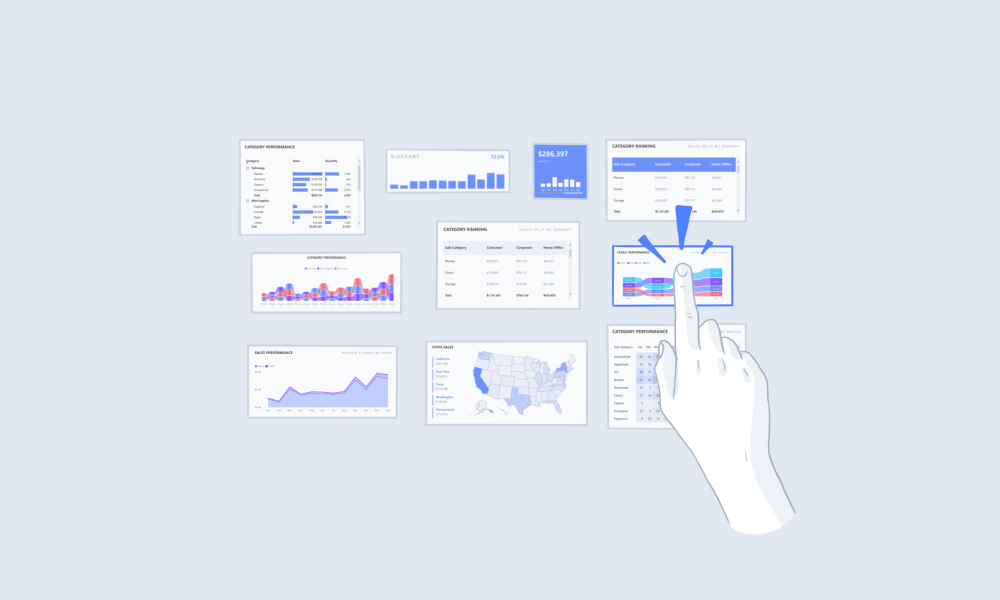
Using the design practice of data visualization in your report will make it easier for your audience to interpret. Using visual aids such as charts, graphs, and other visual elements makes it easier for the brain to understand and retain the information.
Producing easy to understand reports will benefit your business. Employees will be able to grasp what the data is telling them quickly and be able to make more accurate decisions as a result.
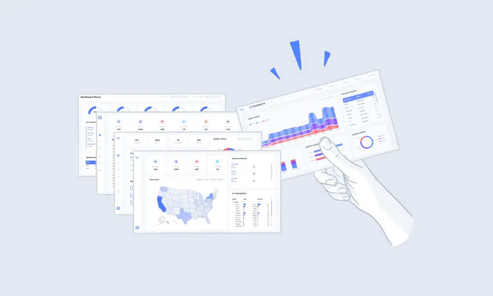
Design helps you build visually appealing reports that stand out from the crowd, ensuring your reports are memorable for your audience.
Using a good design that highlights the key insights clearly and concisely can enable your audience to not only remember the points but also motivate them to take action.
Well-designed reports also build trust and credibility for you, your report, and your business. As an employee, if you design a good report which saves your manager time by cutting out the need to search for the key points, it will build your credibility. As a business, using design will build your brand's reputability whilst strengthening your relationship with your clients.
No-one wants to read a boring report and that's why you need design. It makes your content appealing, easier to understand, and can build credibility. Make your report stand out and get the recognition and attention it deserves.


.png)