Explore the Toolkit
Made with Numerro
Pricing & Sign Up
Learn
Go To Member's Hub
Login
Try it Free
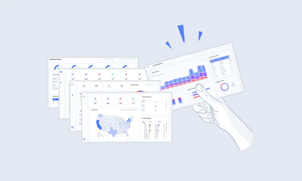
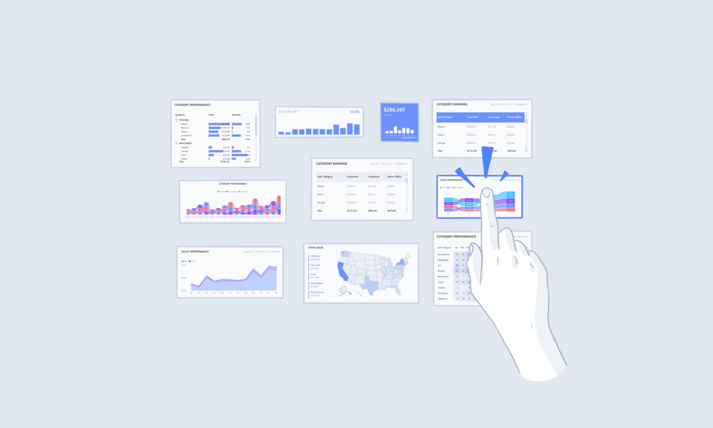
Using Comparison Visuals
Using Area Charts
Utilize the correct Power BI visuals for comparing data. Area charts are great for comparison data.
Summary
Consider using
area charts
in Power BI when:
Discerning trends in overall values over time
Plotting multiple data series with part-to-whole relationships
Exact values by category are less important
Additional Tips
Embracing Simplicity
Margins & Padding
Using Visuals
Not All Visuals Are Equal
Working with Color
Building A Color Palette
Suggested Guides
Handbook
Top 10 Power BI Dashboard Examples + Free Template
Handbook
The Complete Guide to Designing a BI Dashboard Mockup
Handbook
The Complete Guide to Power BI Visuals + Custom Visuals
Suggested Blog Posts
Dashboard Design
Poorly Designed Power BI Dashboards Are Bad for Business
Embedded Analytics
How to Embed Analytics With Power BI - Basic & Advanced
Data Analytics
How Your Company Can Benefit From a Data Driven Culture
Ready to improve your reports?
Get free access today.
View Pricing
Try It Free


.png)