

The goal of any dashboard is to tell a story with data and insights. Using color in your dashboard design will help you to tell the best story, communicating the things that hold meaning and importance.
Color is an important bridge to help you communicate when telling your data-driven story. The choice of color and when to use it, in designing data visualizations, is critical. Ignoring color's importance can result in confusion and poor user understanding, which ultimately wastes your time and money.
Applying color to different parts of your visualization lets you tell a more effective story, one that engages your audience at an emotional level and captures their attention quickly. Well-chosen colors reduce the time to insight for your users and help them understand your message quicker.
It's important to recognize that we use color to communicate every day, so some colors hold universally accepted meanings. For example, when we are driving and approach a set of traffic lights we know that red means stop, amber means caution, and green means go.
Just as using color helps drivers to understand what action to take, the same approach applied to dashboard design helps users understand what actions they should take when making data-driven decisions. For example, use a bright red color to draw the user's attention to something that is concerning or bad. This helps guide attention to the most important insights from your data, which improves the efficiency of users.
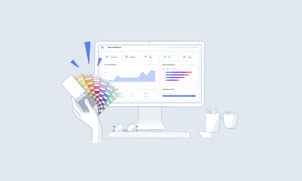
Consistency is key when it comes to using color, as it is the foundation to success when implementing design in your dashboards. You should use chose a theme for your dashboard, and within that theme choose the colors that are going to represent different meanings (we recommend you chose either 3 primary or 2 secondary colors). But, it's still important to incorporate the universal colors of red, amber, and green as well as your branding. Once chosen, stick consistently to this theme, colors, and individual color meanings.
Once you have chosen your theme and individual colors you can start to use them to amplify your insights. For example:
Using color in your dashboard design will take practice, so it's worth spending some time trying different ways of using color in your visualizations to make sure you're communicating your message effectively. The main thing to remember is consistency is key. Numerro can help you incorporate color into your dashboard design simply and easily. The Numerro toolkit includes different themes and a color palette builder to help you make the most impact with your data.
If you're looking for more tips on how to use color in Power BI dashboards, check out our video - Best Practices for Using Color in Power BI Dashboards


.png)